Brad DeLong, in his “Fair, Balanced, Reality-Based, and More than Two-Handed” blog recently posted a couple of charts to buttress his contention that, “employment losses are about to be bigger than in any previous recession since the Great Depression itself”.
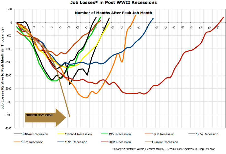
The more alarming chart is taken from Nancy Pelosi’s office wall:
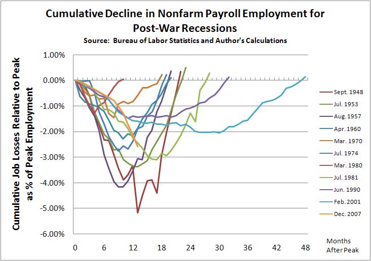
A naive observer might conclude that the current recession is the worst since WWII. Unfortunately this chart doesn’t adjust for the dramatic overall expansion of the labor force over the last fifty odd years. William J. Polley has produced a more informative (less ludicrously tendencious) percentage based comparison. Note that the current recession actually falls somewhere in the middle of the pack for post WWII recessions.
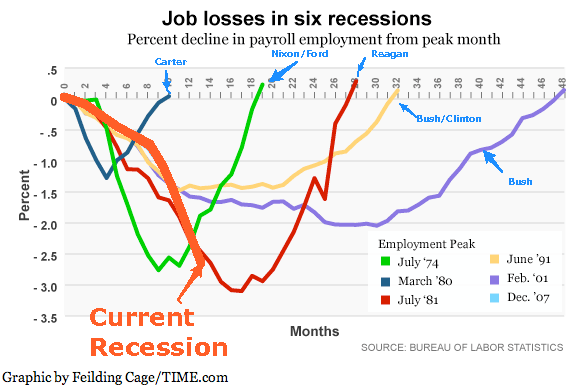
The second chart is an annotated copy of the Time Magazine original.
There is nothing actually wrong with the chart. However, the annotations are interesting. Mr DeLong has added the names of the Presidents who happened to be in office during the charted recessions. It isn’t clear what Mr DeLong’s purpose in doing this was exactly. Perhaps Mr DeLong is trying to suggest responsibility. If so, he appears to have made the classic mistake of confusing correlation with causation.
The other questionable addition is the gratuitous highlighting of the current recession. Painting something bright red and labelling it with a honking a great sign is not exactly the strategy of someone seeking to make a sober analysis. Perhaps the real purpose of this overdone annotation is to conceal the fact that, when charted in relative terms, the trajectory of employment in the current recession looks a lot like that of the 1981 recession. While certainly very unpleasant, the 1981 recession did not in fact result in the end of civilization, which is not the kind of thing you want to dwell on if you are trying to sell people on your, “the world is going to end if Congress doesn’t spend” view of the world.


